Gesture navigation ships as the default on almost every Android phone sold today, and the idea behind that decision is that swiping from the edges is just better. Phone makers aren't lazy; there's a good reason to keep the buttons. More people are using a phone than just those who understand how swiping works or the secrets, and they deserve phones they can use.
The three-button layout is smarter than you think
Gesture navigation shuts out millions of people
There's a reality that tends to get forgotten as we add fewer buttons to phones and rely on the screen. Gesture controls are convenient but genuinely hard to use for a lot of people. Swiping from the edge of a screen might feel natural if you have full hand mobility or grew up as this was designed, but these gestures actually demand a surprising amount of physical precision. You need the right speed, the right angle, your finger in exactly the right spot along a narrow strip of glass.
For someone living with hand tremors, arthritis, or Parkinson's disease, hitting an invisible trigger zone can consistently feel impossible. That's not to mention the older generation that grew up with clearly marked buttons instead of gestures you already have to know about. Missing those buttons is a big part of this, too. A button you can see is much easier to use, but if you were never told about how swiping works or the special ways you can use it, you're not going to know anything about it. You're hunting for a moving target that gives you no feedback until you either get it right or don't.
The old three-button layout works better by design. Back, Home, and Recents used to sit in fixed spots at the bottom of the screen. Some phones still have this in the same spots, every time, on every app. You don't have to look for them. Your thumb already knows where they are. That's not a small thing. A static button you've pressed a thousand times will always be better than an invisible swipe zone.
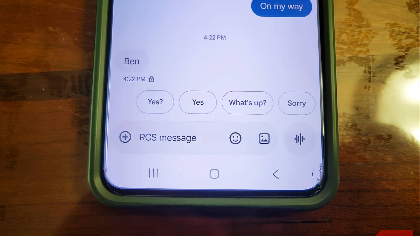
Google clearly understands this, which is why the three-button layout is required on every Android device. The Android Compatibility Definition Document, the rulebook every phone maker must follow to ship Android devices legally, mandates that both gesture navigation and three-button navigation be available on every device. Manufacturers can make gestures the default, but they cannot remove the buttons. Google goes further than just requiring these options. The company warns manufacturers that features such as under-display fingerprint sensors cannot physically overlap with the button navigation area. This is for people who rely on those buttons, so they don't accidentally trigger the fingerprint reader mid-navigation.
The back, home, and recents buttons are still here because phone makers aren't behind the times. They're there because not everyone's hands work the same way, and a phone that can only be operated with perfect dexterity isn't really accessible at all.
Swipes are untrustworthy
Too much is happening on screen
Gesture navigation looks clean, but it constantly gets in the way of actually using your apps. It works by detecting swipes inward from the left or right edge of the screen, so it keeps colliding with apps that use those same edges for their own controls. Try to open a sidebar or pan across a map, and your phone might read it as a swipe to another page or app, or even going back instead. One second you're browsing a rack of clothes or scrolling through Instagram, the next you've been kicked out of the page entirely. It is annoying.
Developers can't really fix this because there's so little space to make it work. Even being able to mark certain parts of the screen as off-limits for system gestures doesn't fix it entirely. Android only lets devs limit a certain amount of edge space because it doesn't want apps to disable the back navigation completely. However, that sidebar menu runs the full height of the screen, so it is helping only a bit more than it hurts.
The problem is compounded by the fact that many apps rely on edge swipes for their own features. For example, a drawing app might use a swipe from the left edge to switch tools, or a reading app might use a right-edge swipe to turn pages. When the system tries to interpret the same gesture for navigation, conflicts arise. Users end up frustrated, often reverting to the three-button layout to regain control. This friction is not just a minor annoyance; it interrupts workflow and can cause data loss if an accidental back gesture discards unsaved work.
Thumb comfort and speed are more important
Cleaner doesn't always mean better
Getting rid of the navigation bar at the bottom frees up screen space and lets apps stretch edge-to-edge, which feels better. There is no arguing that it looks sleeker, but it's hard to justify when it causes this many issues. I may write today, and for the past handful of years, but I used to work with my hands, and it’s not easy to swipe all the time. Gestures are mostly convenient for people who can just sit at a coffee shop, not those who are genuinely hard at work and not completely focused on their phone.
Phones are taller than you think, and constantly swiping in from the far edges means your thumb is making wide, reaching movements across a big glass screen. Do that for hours, and you'll feel it. My wife has a dent in her finger from holding the phone a certain way for years. Three-button navigation gives your thumb a home base. The buttons sit in the same spot every time, close to where your thumb naturally rests, so you're moving maybe half an inch to hit them. That means less stretching, less repositioning, and less strain.
There's also a speed difference, and it comes down to how the phone handles each type of input. With gesture navigation, the phone can't just react the moment your finger touches the screen; it has to wait and register. The system has to track where your finger started, how far it's moved, at what angle, and how fast it's moving before it can make a call. That analysis takes time, whereas the three-button system skips all of that. The buttons are fixed targets, so when you tap one, the phone just checks your touch against a known location and fires immediately. We gave up one of the best and most convenient features of a phone for more screen coverage, which makes little sense when you think about it.
Swiping is not better
Switching back to three-button navigation won't appeal to everyone, and if gesture navigation works well for you, there's no strong reason to change. The extra screen real estate is nice, and the gestures feel fluid once they're learned. Even when I learned the swipes, I didn't use them. It's still more convenient without swiping. Until that changes, there's no reason to alienate those who don't want to or can't learn to swipe.
Beyond individual preference, the existence of three-button navigation serves as a critical accessibility feature. Organizations like the World Health Organization emphasize that digital inclusion must account for varying physical abilities. By keeping the option, Android adheres to the principles of universal design. Furthermore, the three-button layout is more predictable in multi-tasking scenarios. Pressing the Recents button instantly shows a grid of open apps, while gesture navigation often requires a slow swipe and hold, which can be imprecise. The tactile feedback of a tap versus a swipe also contributes to user confidence, especially when using the phone one-handed or in a moving vehicle.
The history of Android navigation is a story of evolution from physical keys to capacitive buttons, then to on-screen soft keys, and finally to gestures. Each step aimed to maximize screen real estate, but often at the cost of usability. The early Android phones like the HTC Dream had a trackball and physical buttons, which provided clear tactile feedback. As screens grew, software buttons became standard, and now gestures are the norm. However, the Android Compatibility Definition Document has consistently required a fallback to button navigation, ensuring that no user is left behind. This requirement is unique to Android; iOS, for example, removed the home button entirely, forcing all users to adopt gestures. Android's approach is more democratic, acknowledging that one size does not fit all.
In practice, many users who try gesture navigation eventually switch back. Anecdotal evidence from forums and surveys suggests that a significant minority of Android users prefer the three-button layout. Phone manufacturers like Samsung, OnePlus, and Xiaomi include easy toggles in Settings to switch between navigation styles. This flexibility is a selling point for Android, attracting users who value customization and control. The decision to keep three-button navigation is not laziness; it is a reflection of Google's commitment to accessibility and user choice. As long as there are users who need or prefer physical buttons, Android will likely keep them available. The real innovation would be to improve gesture navigation's reliability and reduce collisions, while also making the button layout more customizable. Until then, the three-button layout remains a vital lifeline for millions of users worldwide.
Source: MakeUseOf News